 Has this ever happened to you? You bought some inventory based on a scan that showed a good rank, price, and potential profit. But by the time your inventory reached an Amazon FBA warehouse, things had changed dramatically.
You notice that the rank is now way out of your buying comfort zone. Or the buy box price is much lower than before. Maybe now Amazon is selling the product when it didn’t show on the original scan.
Maybe you convinced yourself that “That's just the way it is on Amazon!”
Well, it doesn't have to be.
The Keepa browser extension for Chrome is an awesome tool that helps you make better buying decisions.
If you know how to read a Keepa chart, you can use it to research price and rank history, as well as Amazon selling activity. Keepa charts are available for most products in the Amazon catalog.
The big question is, how do we read and interpret the data on those Keepa graphs?
In today's post, I'm going to share with you exactly how to read a Keepa chart as an Amazon seller. You'll be able to use this information from the Keepa graphs to make better buying decisions.
Now you can stop being surprised by sudden drops in price, spikes in ranks, or Amazon “jumping in” on a product you just purchased (ugh – the worst!).
Using the Keepa Extension
First, let’s take a look at some of the key elements on the Keepa graph.
When you have the Keepa browser extension installed on your Chrome browser, it will automatically display a Keepa graph RIGHT ON any Amazon product page you look at.
As an example, here’s the Keepa chart for a toy (it's an accessory pack for a baby doll):
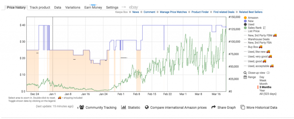
On the left side of the Keepa graph, you will see the price levels. Across the bottom are the dates. And along the right side are the sales ranks.
On the far right are menu options that you can use to customize your view. For instance, if you would like to see only the Amazon (orange) graph, you would click the other three colored circles to take New (blue line), Used (black line), and Sales Rank (green line) off the chart.
You can also view different time frames: Day, Week, Month, 3 Months, Year, or All (entire history of the product on Amazon). I think 3 Month view is the perfect place to start.
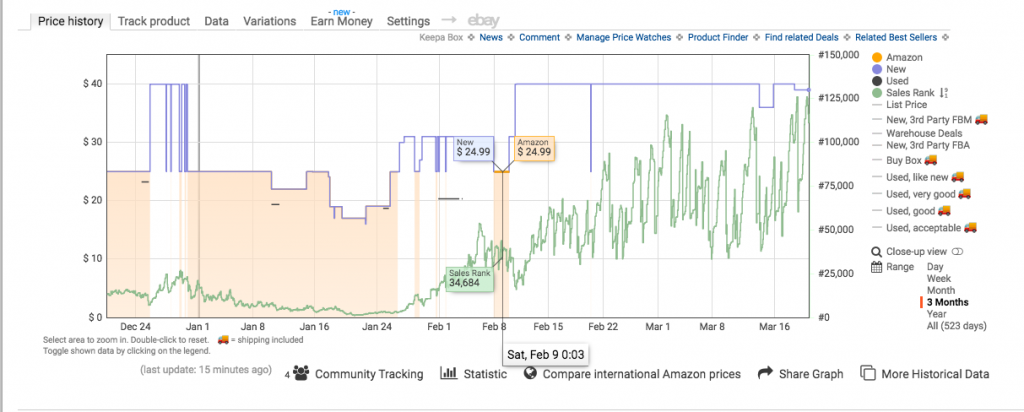
To make it even easier to read a Keepa chart, you can hover your cursor over any point to see the data for that specific date.
In the example below, we see that on February 9th, the low New offer (blue) is $24.99, Amazon’s price (orange) is also $24.99, and the rank is 34,684.
So what is this Keepa chart showing Amazon Sellers?
1. The orange shaded area represents Amazon in stock and the white areas in between show Amazon out of stock
The orange line at the top indicates Amazon’s price. When the orange shaded area is present, that indicates a time when Amazon was in stock and selling this item. When the background is just white, that means that Amazon was not a seller on this listing.
So we can see that Amazon is not selling this product now but they were in stock several times in the last three months.
We can also see that Amazon typically sells this product for $24.99 when they have it in stock. Although they did lower their price to $17.00 for a few days in January.
2. The blue line shows the lowest New offer from a 3rd party seller or Amazon (not the price the item has sold for)
This blue line price will often be a merchant-fulfilled seller or Amazon. On the example Keepa chart above, we see that when Amazon is in stock, they are also the blue line price. That's because, as is often the case, Amazon has the lowest price of any sellers (including MF sellers).
But when Amazon is out of stock, we see the blue line go up higher. For example, when Amazon is out of stock for the first week of February, the lowest offer is at $31.00
It’s important to keep in mind that these offer prices do not include shipping. So as an FBA seller, you would have to assume there is a shipping cost that needs to be “added” to the price.
One advantage of being an Amazon FBA seller is that you will probably get more sales than MF offers, even at a higher price. So keep that in mind and don't necessarily set your FBA price to match the “blue line” price on Keepa. Later, I'll show you how you can view MF and FBA prices separately on Keepa.
Related Post: The Ultimate Guide to Amazon's FBA Program
Note that the black line is the lowest Used price. Because it is not that common for Toys to be sold Used/Collectible, there aren't many Used offers on this chart. This would be more valuable data if you sold Used Books.
3. The green line shows rank history
On this chart, we can see that the rank tends to go up (getting worse) when Amazon goes out of stock, especially if the 3rd party New prices increase. In fact, now that Amazon has been out of stock for over a month, the rank has continued to climb. We can see that this toy was ranked at 30,000 when Amazon was last in stock on February 9. But now on March 20, the rank is 120,000.
This tells me that shoppers buy this toy much more frequently when it's priced at $25 instead of $40. This really demonstrates that rank is a snapshot in time and can change significantly over the course of a month or even a week.
Here's another way you can look at the green line: each spike in sales rank from a higher number to a lower (better) number usually indicates at least one sale. You can try to count the “low points” on the green line on a Keepa chart to count the spikes. You'll note that when the rank is really low in January, it's almost impossible to count the spikes. For a rank that low, we can guess that there are many sales happening with each change in sales rank.
4. View Buy Box and Merchant Fulfilled (MF) Prices for more information
So far, we've just been looking at the lowest New offer (any seller) and the Amazon price. But Keepa can actually show you a lot more information if you toggle on more of those options on the far right.
Here's what we get when we turn on the Buy Box data in the settings.
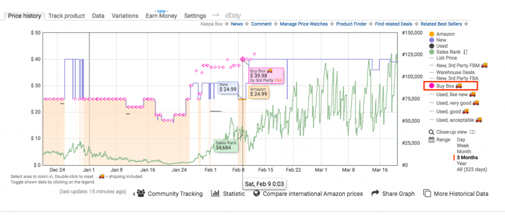
This gives me a lot of interesting information to work with!
The first thing I notice is that on February 9, the Buy Box was awarded to an FBA seller at $39.98 even though Amazon was also in stock at $24.99. This leads me to believe that Amazon was back-ordered on their own inventory at this time. So Amazon let the higher priced 3rd party seller have the Buy Box so that the customer can get the toy faster.
This also shows me that there are large periods of time when there is no Buy Box offer at all. There hasn't been a Buy Box offer since early February. There was also no Buy Box offer the week of Christmas. So clearly Amazon is suppressing the Buy Box when they think the price is too high. It seems like $39.99 might be the highest I can price this while still hoping to get the Buy Box.
Another thing I can change in the settings is to view the lowest New price but only from MF or FBA sellers. For this toy, I wanted to check out the FBM (Merchant Fulfilled) price history:
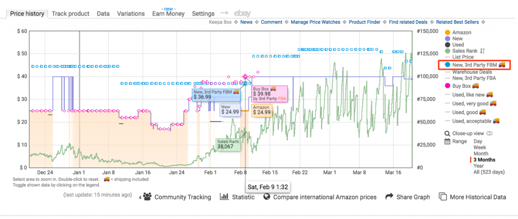
When I take another look at February 9, I see that Amazon gave the Buy Box to a FBA seller even though they were priced higher than the MF seller. Of course, the MF seller may have been charging for shipping which would price them higher than the FBA price.
If you want to view the history of low FBA offers, you can simply turn on the “New, 3rd Party FBA” setting.
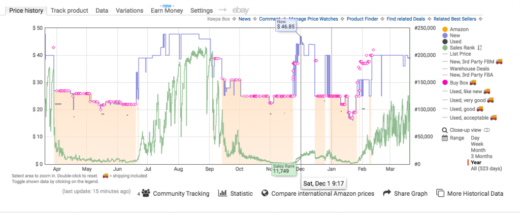
5. Check the Year view or All view for more data
Sometimes it's helpful to zoom out on the time period. If you are making a seasonal buying decision (like toys for December, textbooks in August, or Easter candy in March), you might want to check the Year view.
Related Post: 9 Types of Items to Sell on Amazon
Let's zoom out to the Year view on this same toy. On Dec 1st last year, the low offer New price jumped up to $46.85 with a rank of 11,749.
Amazon was out of stock on this toy for several weeks during the peak holiday period, but the product still sold with a Buy Box price of nearly $40. This kind of data is really helpful to have when you're sourcing for Q4.
Advanced Keepa Features
There are some advanced features and settings that you might want to view in Keepa to enhance your research. You can test these out after you're comfortable with the more standard features above.
You probably won't need to look at all of these for every product, but you never know when one or two of them may come in handy.
Keepa Statistic: Pricing History and Averages
Hovering over the word “Statistic” will display a different type of chart (example below).
Here you can see the historical pricing for the item you are looking at. You can see the history of the price when Amazon was selling the item as well as third party sellers in both New and Used pricing.
You can see the Lowest Price, Current Price, Highest Price, and the Average Price for the last 90 days and the last 180 days.
I like that we can see the dates that correspond to the price changes as well.
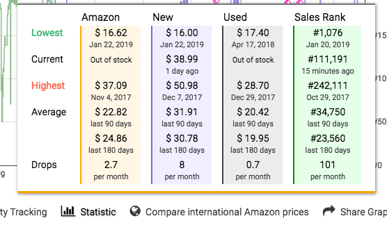
Keepa Statistic: Sales Rank History and Averages
The last column (the green column) shows us the Sales Rank data. Like the pricing history, you can view the lowest, current, highest, and average sales ranks.
Why is this helpful? Because this will help you know if the current rank/price is just a temporary thing or if it has been similar in the past. In the image above, you can see the current rank is #111,191, but the average rank has been much lower (better).
This shows me that I could possibly sell more of this product by lowering the price a little. Hopefully the current high rank is just because of the current high selling price.
What Are The Drops Shown on Keepa Statistics?
You can also see the section called “Drops” across the bottom of the Keepa Statistics. Many people have wondered what it means when Keeps shows Drops in the Statistics section.
Drops on Keepa has to do with the number of times that the price or rank has gone down in the set time frame. Specifically, it is the average count of drops per month for the last 90 days.
So each time the price is reduced, that is counted as one drop. This can help you determine pricing volatility for a product.
A sales rank drop is any move from a higher rank to a lower rank. If the rank changes from 20,000 to 8,000, that will count as one drop. A sales rank “drop” does not necessarily mean the product was sold even though most sales rank drops correspond to a sale (or multiple sales).
Keepa recommends that you not read too much into the Drops statistics. But they can show you some information at a glance. Personally, I use the Statistics section to view average ranks and prices.
View the Number of Offers/Sellers on Keepa
Clicking on More Historical Data will open another chart right below the main Keepa graph. This chart shows the number of New and Used offers at any given time.
For the toy we've been looking at (chart below), the New Offer Count has been relatively stable. This suggests that supply and demand are relatively equal.

A steadily decreasing offer count is a good indicator of hard to find stock. This may indicate that prices could go up as supply becomes limited.
When the number of sellers keeps going up, it shows that the stock is being replenished faster than it is selling. I think of rising Offer Counts as a red flag.
Here's an example of a Toy that went from 5 offers in September to over 200 offers by December 1.

Even though the rank is super low, once Amazon came on the listing, they got all of the sales. In the meantime, the number of third-party offers just kept increasing. Those sellers were waiting their turn to get sales.
You can actually see that when Amazon goes out of stock, the offer count drops by about 50. This is a great example of how you can use all of the Keepa data together to make a buying decision.
View Product Rating & Review History on Keepa
In 2020, Keepa expanded the “More Historical Data” section to also include tracking for a product's Rating and Review Count. You can toggle these two lines on alongside the New Offer Count.
Here's a chart for a Toy that's had a nearly steady 4.5 Product Rating over the last 3 months.

I can see this feature being really helpful for the product research that's common among Private Label and Wholesale sellers. If you do Arbitrage, it's probably less important. However, if you noticed that a product has a sharp decrease in Rating over time, that might signal a quality issue with the item itself.
New for 2020: View Sales Rank History for Subcategories
As of March 2020, Keepa has started tracking subcategory rank history. This is separate from the main “green line” rank that you can see on the primary Keepa chart.
To view this secondary Sales Rank chart, click on sub-ranks next to Sales Rank on the main chart.

This will open up a new graph dedicated to sales rank right below the main graph.
![]()
In this example we see a popular toy with a current rank of 11,768 in the main Toys & Games category and a rank of 26 in the Action Figure Vehicles subcategory. The number next to the subcategory (3 in the example shown here) indicates the sublevel of the subcategory.
This Action Figure Vehicles subcategory is 3 levels deep:
- Action & Toy Figures
- Action Figure Playsets & Vehicles
- Action Figure Vehicles
So the reason it has such a good subcategory rank (26) is because it's in a very small subcategory.
This is interesting data to have, but when you're sourcing, you always want to make your decision based on the main category sales rank. So don't convince yourself that an item will be a hot seller just because it has a good rank in a tiny subcategory.
How to See the Keepa History While Scanning Products On Your Phone
Since many of us could really use this Keepa information on the go, it's important to know that you CAN access this information on mobile. The easiest way to do this is by using the Scoutify Scanning App when sourcing.
When you're scanning with Scoutify, you can just click on the Keepa button to view that item's Keepa chart right away. Without the Scoutify app, you'd have to copy the ASIN from the Amazon Seller App, open a web browser, go to Keepa.com, and paste in the ASIN.
You can read more reasons why I use the Scoutify App here in my full review.
Keepa Paid Account vs Free Account
In February 2019, Keepa stopped giving free access to all of their charts. Honestly, this didn't really surprise me because Keepa has always been one of the most valuable tools that an Amazon seller can use.
Related Post: The Top Tools We Recommend For Online Sourcing
With a Free plan, you can view pricing histories, but you can't view any sales rank history (green line). Free plans cannot view Buy Box pricing or Offer Counts either.
Here's what our sample Keepa chart looks like as a free user. I have an arrow pointing to the “Lock” symbol which indicates data that's only for paying customers:

So there is definitely still some value in seeing this free data because it shows that Amazon goes in and out of stock on this product. But without the green Sales Rank line, I'm missing the full picture.
After you install the Keepa extension, it's up to you to decide if you want to upgrade to a paid account. You can do that easily by toggling on one of the “locked” features.
You'll need to create an account and sign up for a paid Data subscription. Keepa is a German company, so the monthly subscription rate is 15.00€. Keepa will charge your card in Euros and your credit card company will handle the currency conversion. My last Keepa charge was $17.05.
I think the paid Keepa account is definitely worth it because of how much more data you can see with a paid account.
Want to Know Even More About Using Keepa Charts in Your Amazon Business?
So there you have it! Now you know how to read a Keepa chart.
Knowing how to read a Keepa chart will help you limit risk, plan for pricing changes, and make sourcing decisions with confidence.
If you would like even more information on how you can read and use Keepa charts, I highly recommend The Reseller's Guide to Keepa video course!
It's honestly a lot easier to explain Keepa in a video course than in a blog post. Stephen has done such a fantastic job with this training, so check it out if you want true Keepa mastery!
Have any questions about Keepa? Has it saved you from making a bad buying decision? Please share with us below!
